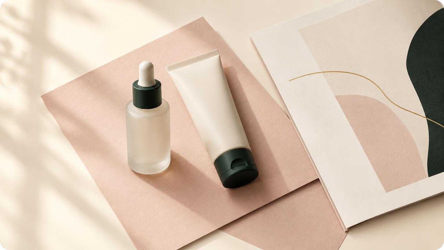
A beauty website should do two things at once: create desire and make the next step clear. The strongest sites do not choose between an editorial point of view and commercial clarity. They use the first to make the second feel natural.
That matters as beauty discovery moves across websites, social platforms and commerce experiences. Sephora announced a TikTok Shop pilot for the United States beginning September 19, 2026, built around monthly product drops, creator-led content and live shopping. The lesson is not that every brand needs a TikTok Shop. It is that the path from inspiration to action is becoming more connected.
Start with a point of view
Editorial does not mean vague. It means the brand has made decisions about what it believes, how it looks and what it wants the audience to feel.
For a beauty brand, that point of view might show up in the image rhythm, the way ingredients are explained, the balance of whitespace, or the language used to describe a product. The details should feel connected rather than decorated.
Curate begins with the sharper truth in a brand: its positioning, voice and offer. That strategic foundation gives every later page a reason to exist.
Let every page answer a real question
A beautiful homepage cannot carry the whole experience. Visitors still need to understand:
- Is this for me?
- What does the brand or agency actually do?
- Why should I trust it?
- What happens next?
The answer should be visible in the structure, not hidden behind atmosphere. A service page can feel considered while still naming the offer, the audience, the scope and the next step. A project page can be expressive while showing what changed and why it mattered.
This is where editorial design becomes useful. It gives the visitor a clear reading order: the promise first, the proof next, then the detail that helps them decide.
Build proof into the visual world
Beauty brands often have strong imagery but weak evidence. A product can look premium and still leave a visitor uncertain about its purpose. A campaign can feel polished and still not explain what makes it different.
Pair the image with a useful sentence. Show the thinking behind the work. Explain the result without turning the page into a case-study template. Proof can be a client quote, a process detail, a clear deliverable or a measured outcome—as long as it is specific and true.
Curate's site describes this as strategy that moves the numbers: beautiful brands need momentum behind them, not just attention. That is the standard worth carrying into every page.
Make the next step feel like part of the story
Calls to action work best when they arrive at the moment a question has been answered. “Start a conversation” feels more inviting after the visitor understands the service, the process and the kind of partnership on offer.
The action does not need to be loud. It needs to be consistent. The same voice, spacing and visual language should carry the visitor from the first impression to the contact page.
A website that converts is not necessarily the one with the most buttons. It is the one that removes uncertainty at the right moments.
A practical checklist
Before launch, ask:
- Can a new visitor describe the offer after one scroll?
- Does each service have a clear audience and outcome?
- Is there proof near the decision it supports?
- Does the mobile layout preserve the reading order?
- Is the contact step specific enough to begin a useful conversation?
If the answer is no, add clarity before adding more decoration.
FAQ
### Can an editorial website still be practical?
Yes. Editorial direction should shape the hierarchy, not hide it. Strong typography, imagery and pacing can make the useful information easier to absorb.
### What should a beauty brand explain first?
Start with the audience, the promise and the reason to believe it. Then explain the offer, the process and the next step.
### Does every page need to sell?
Every page should help the visitor make progress. That may mean building trust, answering a question, showing proof or inviting a conversation.
### Where should a brand begin?
Begin with positioning, voice and offer structure. Once those are clear, the visual direction and page flow become more coherent.
Last updated September 14, 2026.
References
- [1] Source 1 — author, journal, year. Replace with the citation this passage rests on.
- [2] Source 2 — author, journal, year. Replace with the citation this passage rests on.